Why Google introduced a new icon system
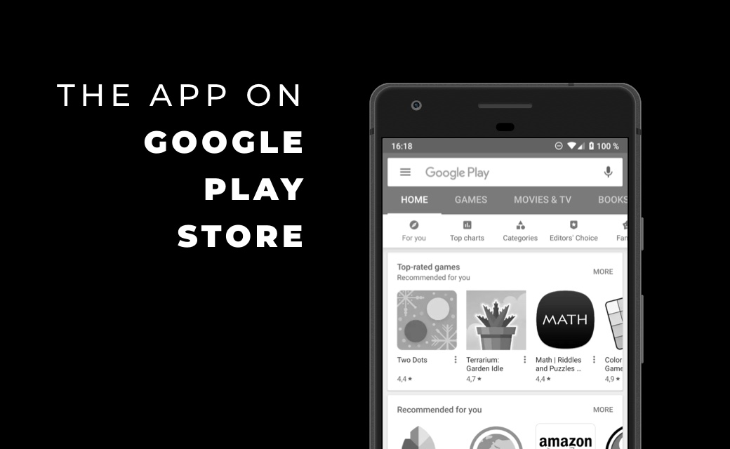
Before the introduction of the current system, the Google Play Store had a very
inconsistent visual appearance. App icons varied greatly in shape, proportion, border
design, and the use of shadows. Some icons were round, others square, some had thick
frames or strong drop shadows, while others were completely flat.
This led to messy app lists, poor comparability between applications, and recurring
display problems on different devices and screen sizes. Especially with new layouts or
platforms—such as tablets, Chromebooks, or wearables—these freely designed icons quickly
reached their limits.
With the new icon system, Google is pursuing a clear goal: greater visual consistency,
improved readability, and a consistent user experience—regardless of the device or
context in which the Play Store is used. Uniform basic shapes ensure that the focus
remains on the actual artwork and is not distracted by random edges, shadows, or
outlines.
Freeform vs. uniform symbol format

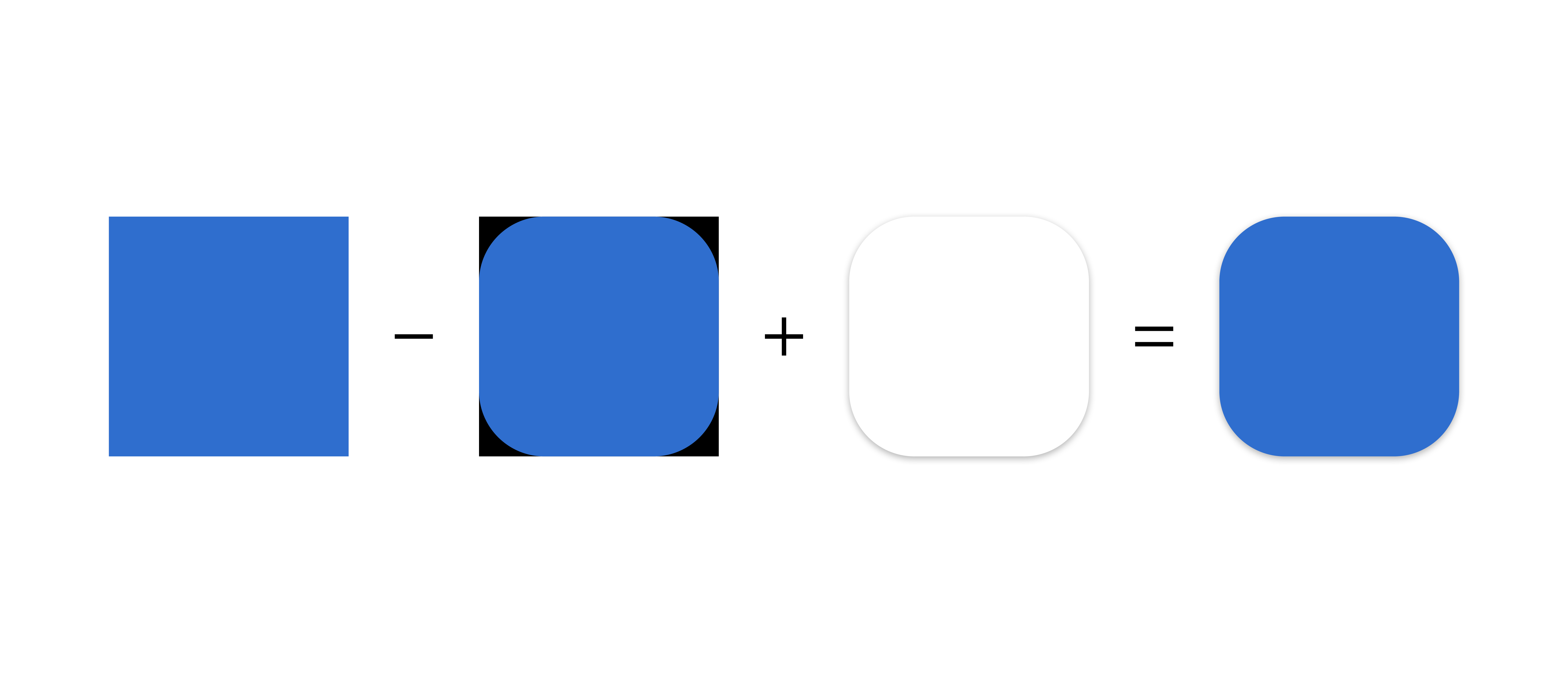
Figure 1: Freeform vs. uniform
Instead of uploading finished, individually shaped icons, developers now upload a square
original asset. This serves as the basis for all further representations. Rounded
corners, masks, and system-wide drop shadows are no longer created in the icon itself,
but are generated automatically and dynamically by Google Play.
The big advantage of this approach is flexibility: the same symbol can be adapted to
different UI sizes, layouts, and interfaces without having to maintain multiple
versions. At the same time, the display remains consistent throughout the store and
follows a clearly defined visual grid.

Figure 2: Dynamic processing
Key requirements for Google Play icons
To ensure that this system works reliably, Google defines clear minimum technical
requirements for app icons. The icon must have a resolution of 512 × 512 pixels, be
saved as a 32-bit PNG, use the sRGB color space, and not exceed a maximum file size of
1024 KB. It is also important that the asset is a complete square without any rounded
corners and does not contain any outer drop shadows.
Rounded corners and shadows must not be part of the graphic, as these elements will be
added automatically by Google Play later on. This is the only way to ensure that all
icons in the store have a uniform appearance and are technically clean.
Design with keylines instead of forced filling
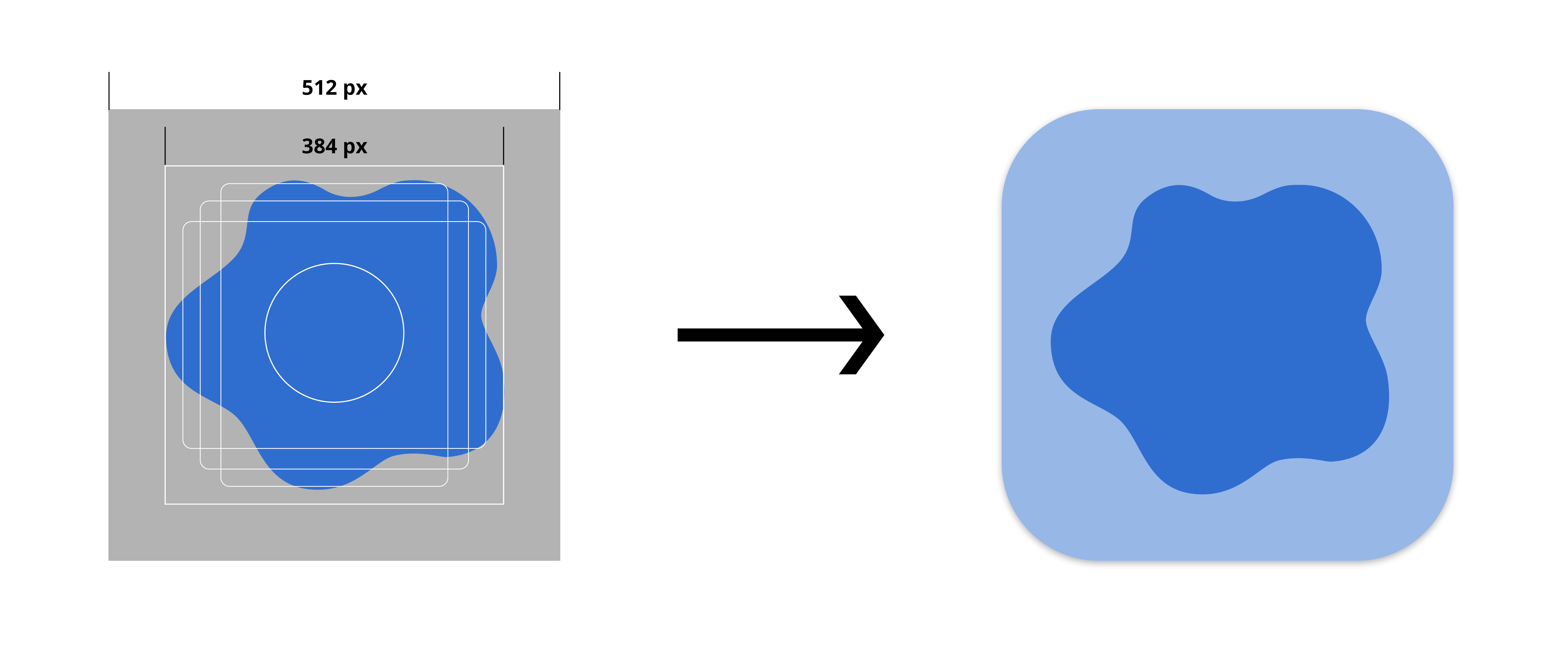
A central element of the design guidelines are the so-called keylines. These are visual
guidelines that help designers place logos or graphic elements harmoniously within the
square icon area.
These key lines provide guidance without unnecessarily restricting the design. Logos, for
example, do not necessarily have to fill the entire area, but can deliberately work with
white space. Illustrative motifs, on the other hand, can be designed without borders if
this serves the motif. The only important thing is that brand shapes are not distorted
or artificially scaled just to make maximum use of the available space. This preserves
sufficient creative freedom without compromising the visual consistency of the store.

Figure 3: Keylines
What is expressly prohibited in the app icon
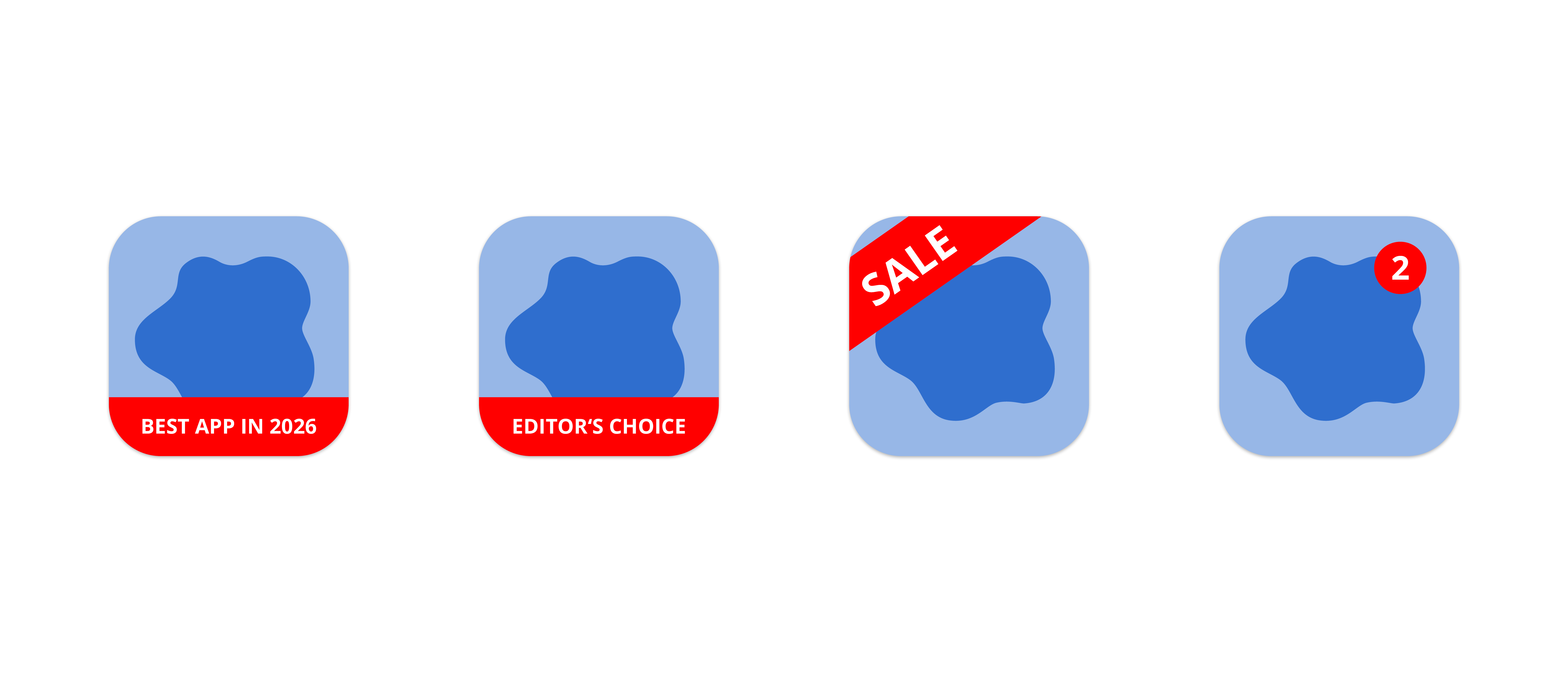
Google Play draws a clear line when it comes to certain content in app icons. The icon
should represent only the app itself and may not be used as marketing space.
Accordingly, text or graphics relating to rankings, ratings, or placements are
prohibited, as are Play program badges, installation prompts, or other system-related
references.
Advertising content such as discounts, special promotions, or limited-time offers also
have no place in the app icon. Furthermore, misleading or deceptive elements are
expressly prohibited. The icon should inspire trust and convey a clear visual
identity—not attract attention at any cost.

Figure 4: Don'ts
Shadows: permitted, but controlled
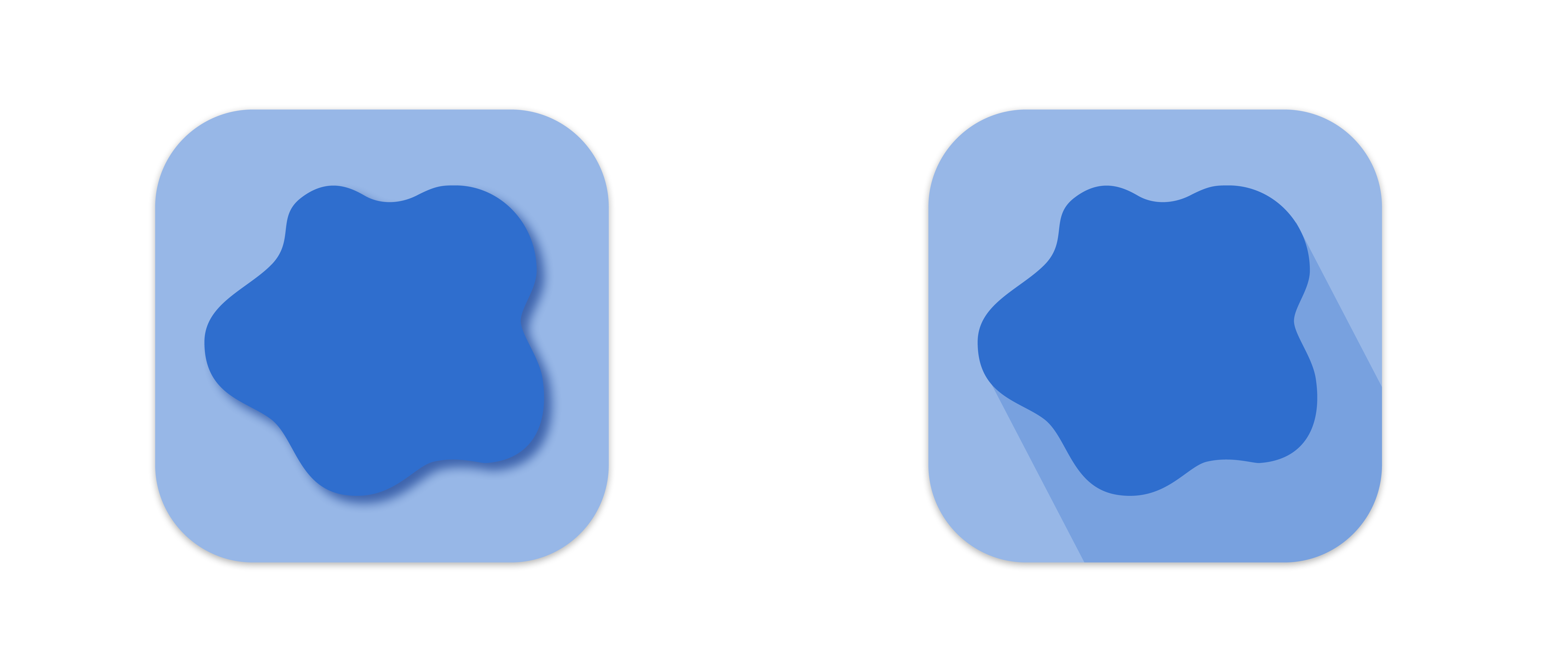
Shadows are generally permitted in app icons, but only as part of the actual artwork.
Illustrative shading or light gradients within the graphic are possible and can be used
specifically to convey depth or materiality.
However, outer drop shadows or effects that extend beyond the actual motif are not
permitted. These are added automatically by Google Play at a later stage. The final
depth effect is thus created by combining the artwork with system-side processing. This
ensures that the icon remains flexible in terms of design, while at the same time
appearing consistent and system-compliant in all display variants.

Figure 5: Shadows
Compatibility mode and migration
App icons that do not comply with the new guidelines and were uploaded before the
changeover have been automatically transferred to a so-called compatibility mode by
Google Play. In this case, the icons are reduced in size and adapted to the new keyline
grid in order to embed them visually into the new system.
Uploading new app icons according to the old specifications has not been possible since
2019. Anyone publishing an app or updating an existing icon today must comply with the
current guidelines.
Brief summary – the most important points at a glance
- Google Play uses a unified icon system for greater consistency and a better user experience
- App icons are uploaded as square original assets; masking and shadows are applied automatically
- Clear technical specifications regarding size, format, color space, and file size
- Keylines help with the placement of logos and motifs without forced filling
- Marketing content, reviews, and misleading elements are prohibited in the icon
- Shadows are only permitted within the artwork; external effects are handled by Google Play
- Old icons are adapted in compatibility mode, new ones must comply with current guidelines


