Trendsetter Apple
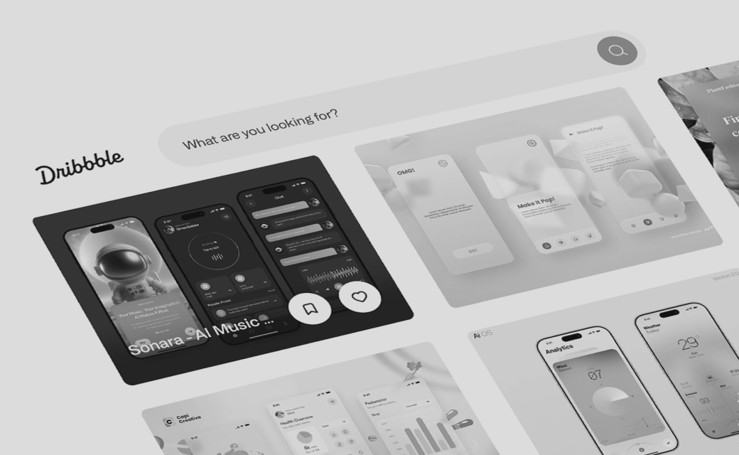
Admittedly: It was somewhat foreseeable and yet few designers dare to implement 3D
elements, that actually end up being incorporated into an app. Today, if you search
platforms like Dribbble, Pinterest and Behance, you will quickly find what you are
looking for: Numerous website and app concepts with protruding buttons, glass-like icons
and floating tiles are doing the rounds. And yet such concepts have been around for
several years. But why is this trend really taking off right now?
It has to be said quite clearly that Apple is an absolute trendsetter when it comes to
design. Last but not least, the introduction of the flat design from iOS 6 to iOS 7 in
2013 introduced a new design language and the understanding of app icons, which almost
only consist of rectangles and circles, almost overnight. Numerous operating systems
like Android or the Windows Phone quickly followed suit here. It remains to be seen
whether the upcoming update to macOS Big Sur will open another chapter in the design
world. It will also be exciting for the design content of smartphones, because in
contrast to the update on Mac and the like, the design language remains untouched there
for the time being.

Figure 1: New user interface under macOS Big Sur; Revised Dock with
Neumorphism elements; Control Center with transparency layers; Photo and Mail windows
with primary and secondary design elements.
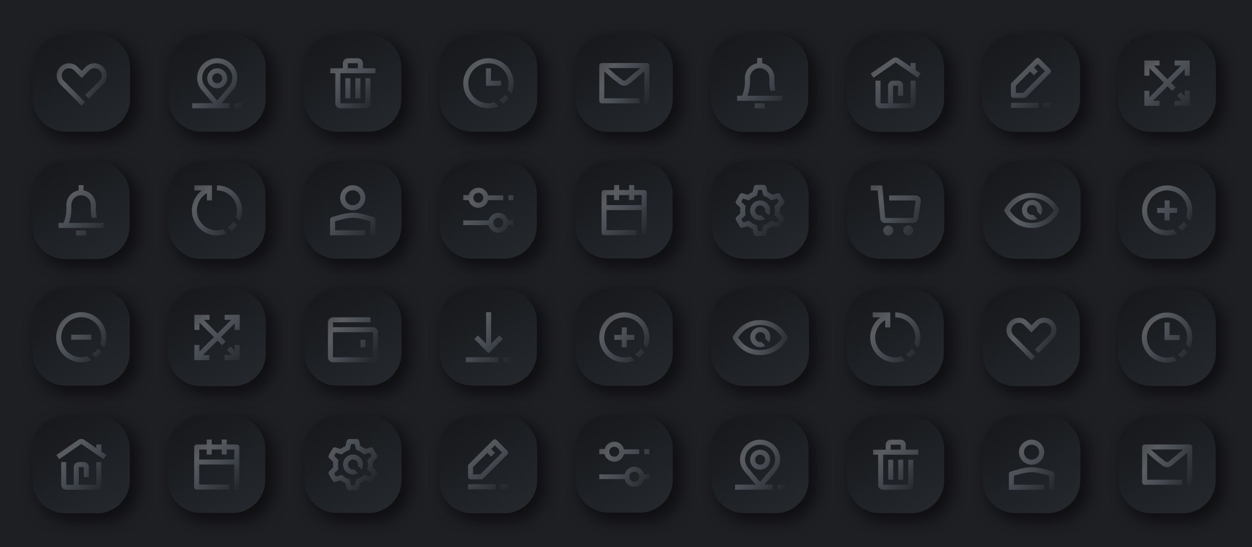
Skeumorphism + Flat Design = Neumorphism?
Let's first take a look at the history of Neumorphism and how there was a first direction
into this design language with Skeumorphism. In the first versions of smartphone and
desktop operating systems, the aim was to make it as easy as possible for users to enter
the digital world, but at the same time as familiar as possible. That is, if, for
example, a note that was previously written down with a real pen on real paper should
now "feel" as much the same as possible on the digital version. Thus, the appearance of
the interface of the application or program was also designed accordingly. The notes app
gets yellow textured paper with lines in a fancy leather cover. The camera app has a
real-looking lens with a lot of shine, and the settings app has several protruding
metallic gears.
The principle behind the design and the brainstorming about the look of an app were quite
simple. However, this is by no means true for the graphic implementation of the graphic
designers' designs. Ten years ago, there were no clearly defined guidelines on how to
implement such a design. Even programs like Sketch, Adobe XD or InVision had not yet
been developed at that time. In fact, there was only one program at that time, that
still masters shadows and depth very well today: Photoshop. What is hardly used today as
pure design software, was then the program for creating spatial icons.

Figure 2: Development of an App Icon from Real Object to
Neumorphism Design
The switch to flat design in 2013 was a major turning point. Suddenly, plastic 3D effects
such as shadows and textures were eliminated. The new design interface naturally drew a
lot of criticism. Many users couldn't tell the difference between clickable buttons and
non-clickable design elements. So it took some time for users to love and appreciate the
newly introduced look. And since from now on, for example, the Notes app will only
consist of two colored areas and three lines app icons became easier and faster - even
if there are still many factors to consider for good and clear design. After a few weeks
the flat design was established on the above mentioned platforms and became quite
popular. After a few months, many websites and big brands also followed the design
trend. Graphic programs were developed and it was easier than ever to create a screen
design without drop shadows and disturbing effects.
With Neumorphism, in a way, the elements of Skeumorphism and Flat Design merge. And yet
we have only just become familiar with flat design. Numerous companies are still
converting their logos to the 2D look and removing gradients, gloss and reflections, and
now all that is to be thrown overboard again? No, not quite. From a neutral point of
view Neumorphism concentrates on objects interacting with light in a three-dimensional
space. The right lighting now comes to the fore much more to the fore than ever before.
Lights affect the transparency of an object, even its the function. But what does this
mean for design? Objects are given more layers and depth again, and individual elements
move back into the foreground thanks to light shadows. Objects lying on top of them are
also with shadows and gradients from different angles, and transparencies make
individual features stand out from the background. Thanks to these layers, it becomes
apparent which feature is in the foreground.
Nevertheless, primary elements that allow the user to work quickly are designed quite
simply in the flat design. Less important objects recede into the background and contain
more effects such as transparencies. It is important to mention that the move to
Neumorphism is less significant than than it was the case from Skeumorphism to Flat
Design. This is because user confusion caused by a new design layout could have a
deterrent effect, so that customers go back to other familiar software and products, and
that is and that is something you want to avoid at all costs.

Figure 3: Further development of the "Finder" icon under macOS; the
update from Flat Design to Neumorphism is less noticeable
You can love it or hate it
Much like the introduction of Flat Design, the first impressions and reactions on the
social web are rather sobering and mostly negative. Neumorphism Design has been dubbed
an "early design experiment", while some others have made the point that this was the
work of designers more committed to formalism than usability. I myself have learned
during the flat design era and have not and have not been involved in any projects that
required skeumorphism. Therefore, I personally find Neumorphism as a basic concept quite
good, it seems exciting and refreshing - however, it still has to be fully confirmed
from the user's point of view. It will also be exciting to see how the design performs
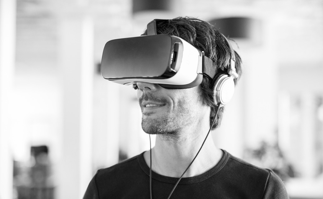
in everyday life and in daily use. Especially since many large technology companies are
focusing on virtual and augmented reality, i.e. objects that can be depicted and
displayed three-dimensionally in a room. If this makes our everyday life much easier
with various VR or AR glasses, and helps us to do our daily tasks, then Neumorphism is
just the beginning of something really big and comes just at the right time.
Image and text references: