App design and accessibility in the new iOS 26
App Icons
With iOS 26, app icons respond to transparency and blur. To achieve optimal results, it
is recommended to keep icons as simple as possible and use one or two colors. This way,
they remain clearly visible even with dynamic effects. At the same time, users can
further customize their home screen and choose between light, dark, clear, or tinted
versions.

Figure 2: The app icons are available to users in different color
levels.
Controls
Controls also benefit from the new Liquid Glass design: sliders and toggles dynamically
adapt to the transparency effects, while buttons blend seamlessly into menus or
popovers. This ensures a consistent, fluid user experience across the entire system.
Navigation
The Liquid Glass design is used at the top level of the user interface,
especially for central navigation elements such as tab bars and sidebars.
The transparent, floating appearance allows users to focus more on the
underlying content, while the navigation remains subtly in the background.

Figure 3: App control element with transparent blurred background
and a background image with sea, sun and water.
Menus and toolbar
The new design allows similar interactions to be grouped, making it easier for users to
recognize recurring actions. Optionally, icons can also be enhanced with text, so that
even users who use VoiceOver can easily understand the icons' functions.

Figure 4: Navigation elements at the bottom in the new Liquid
Design. Elements are grouped on the left.
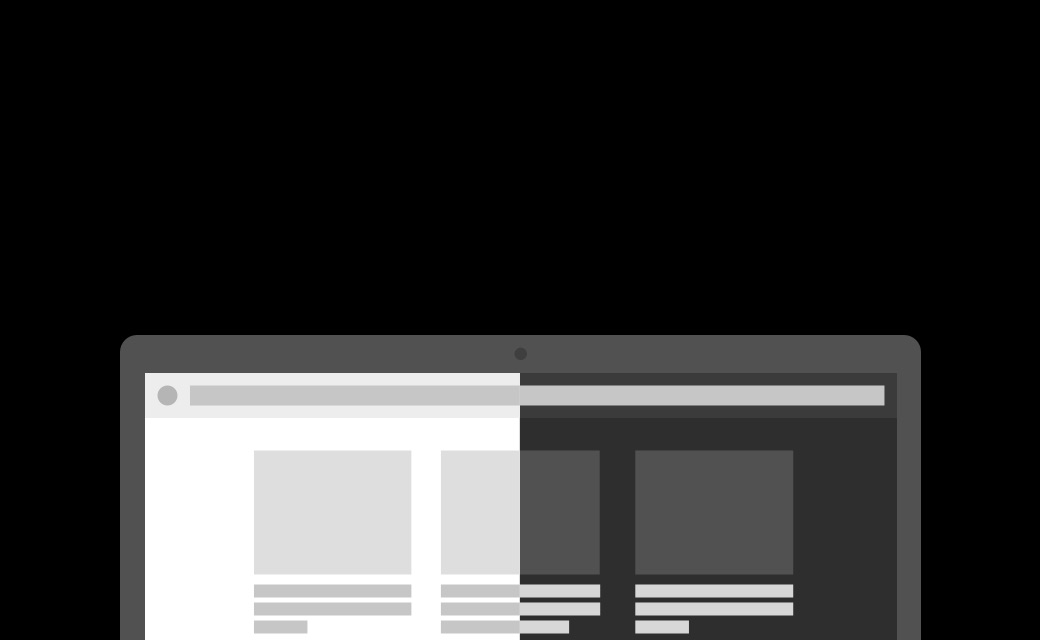
Modal views and lists
Modal views in iOS 26 will be resizable and will have a larger corner radius,
so they adapt smoothly to the curves of the device. Lists, tables, and
forms benefit from increased line height and more padding, which improves readability.
Note for designers: Titles and headers will no longer be
automatically displayed in uppercase and must be manually adjusted if necessary.

Figure 5: List view comparing before and after.
Other useful features that focus on accessibility:
iOS 26 offers numerous features that prioritize accessibility.
Apple Intelligence features support users with smart assistance, text and
image generation, and live translations. Text can be simplified to reduce cognitive
barriers, while live captions and translations make videos accessible to
the hearing-impaired. Image descriptions make it easier for the visually impaired to
use visual content. Other features include the Braille Experience,
nausea reduction tools, enhanced parental controls, improved
audio recording quality, and a redesigned Photos app.
Accessibility in iOS 26: Standards and Visual Clarity
What does accessibility mean?
Accessibility refers to equal access to digital media for all users, including people
with auditory, visual, or motor impairments. The Web Content Accessibility Guidelines
(WCAG) serve as an internationally recognized guideline for this. Apple has also
implemented its own standards: The Human Interface Guidelines (HIG) specify how
accessibility should be considered in iOS apps. Both WCAG and HIG are standards intended
to provide guidance for designers and developers, but are not legally binding
requirements.
Liquid Glass: Readability and Accessibility
The liquid glass look appears modern and three-dimensional, but poses potential
accessibility risks, especially with regard to readability. Transparent UI components on
complex backgrounds can complicate the visual hierarchy and impair user orientation. To
avoid contrast problems, text should be legible despite transparency, and a minimum
contrast ratio of 4.5:1 (WCAG) should be maintained. Foreground elements such as modals
should be clearly distinguished from the background to clearly indicate interactivity.
With reduced transparency, the use of solid backgrounds is also recommended.

Figure 6: A chat image showing the transparent Liquid Glass design.
Chat messages and a poll are superimposed over a colored background image. Some
text has too little contrast, which reduces readability.
Movements and animations should be used discreetly to avoid overwhelming users and
minimize the risk of seizures; static layouts can be useful in such cases. Consistent
menus and toolbars facilitate the recognition of standard actions, while icons should be
supplemented with text for accessibility reasons. Using the system icon set (SF Symbols)
also ensures compatibility with VoiceOver. Designers can use the iOS 26 UI Kit to design
standard components in the Liquid Glass style and test the user interface for usability
before release.
Design recommendations for accessible apps
Movements and animations should be used discreetly to avoid overwhelming users and
minimize the risk of seizures; static layouts can be useful in such cases. Consistent
menus and toolbars facilitate the recognition of standard actions, while icons should be
supplemented with text for accessibility reasons. Using the system icon set (SF
Symbols) also ensures compatibility with VoiceOver. Designers can use the iOS 26 UI Kit
to design standard components in the Liquid Glass style and test the user interface for
usability before release.

Figure 7: Three screens with the new Liquid Glass design. Shown are
the lock screen, the home screen, and the Safari navigation. This image illustrates the
transparent and floating aesthetic of the new design.


