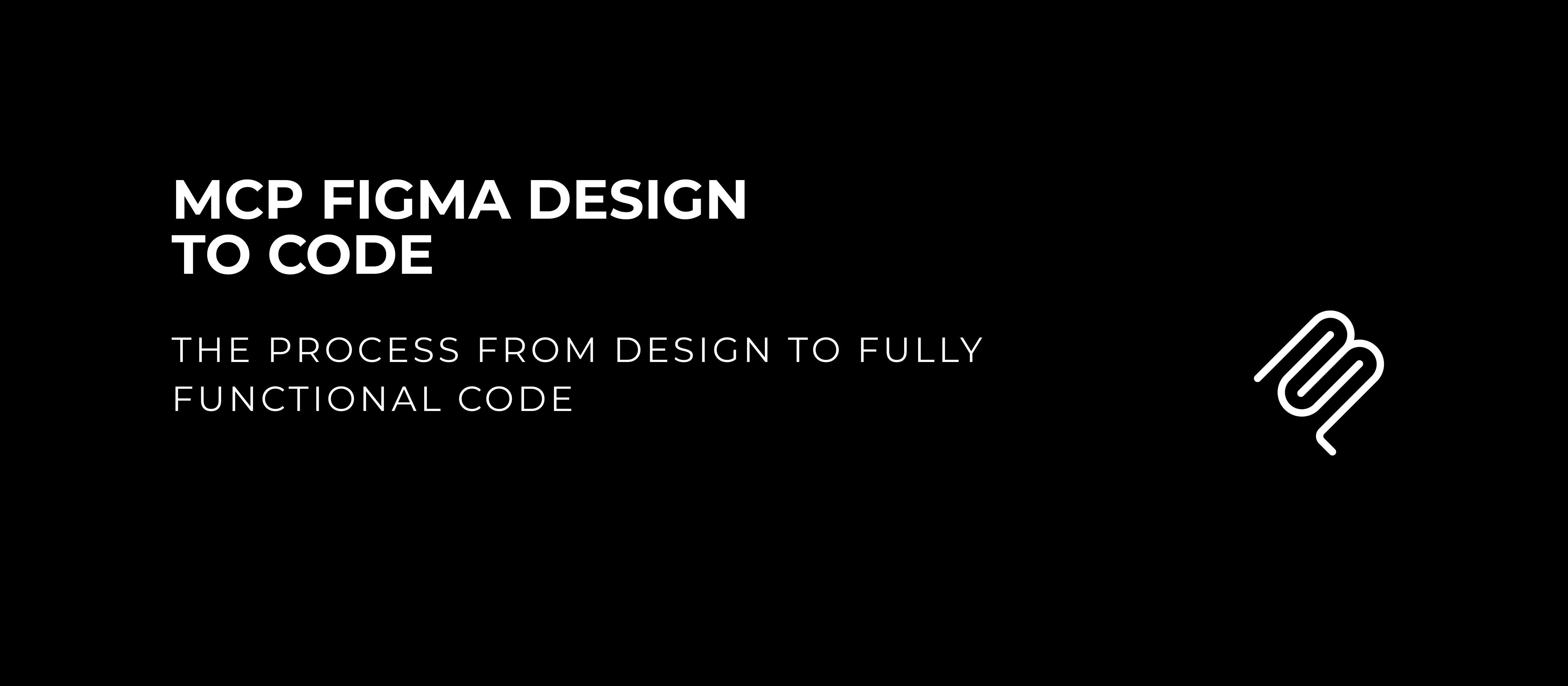
What is MCP?
MCP (Model Context Protocol) is a standardized interface that allows AI models to
communicate in a structured way with external tools, design systems, and development
environments. In the context of Figma design-to-code, MCP enables AI models such as
OpenAI, Claude, or GitHub Copilot to do more than analyze screenshots or static exports
- they can access semantic design information directly.

Figure 1: MCP connects code, AI agent, and Figma Dev Mode.
Why MCP is relevant for UX and project teams
For UX teams, product owners, and project teams, MCP is not just a technical topic. It
changes the way design decisions are transferred into development.
The biggest advantage lies in the connection between design, codebase, and design system.
When the AI understands which components exist, which tokens are used, and which rules
apply in the project, it can deliver much more consistent results. Figma recommends
using components, Code Connect, variables, semantic layer names, Auto Layout, and
annotations for better code.
This means: the better a design system is maintained, the more valuable it becomes for
AI-assisted development. A good Figma structure is therefore not only a design quality
factor, but directly a code quality factor.
From classic handoff to AI-assisted development
Figma Dev Mode: The classic standard
Before MCP, Figma Dev Mode was the central handoff point between design and development
for many teams. Designers create interfaces in Figma, and developers then transfer
measurements, colors, text styles, spacing, and assets from Dev Mode.
This process works, but it is often manual. Developers have to interpret design
decisions, map components, derive responsive behavior, and take technical rules from
the codebase into account. This is often where friction appears.
Figma Dev Mode + MCP: More context for AI systems
With MCP, the classic Dev Mode workflow is extended by an AI-assisted context layer. The
AI can use structured information from the Figma file through the Figma MCP server.
This includes, for example, components, variables, assets, layout information, and
concrete variants. OpenAI explains for Codex that the Figma skill can be used to access
the Figma MCP server and retrieve structured design context, variables, assets, and
the exact variant needed for implementation.
This creates a more intelligent design-to-code process. The design is not only analyzed
visually, but understood in its structure. Components, states, spacing, and hierarchies
can be translated into code more effectively.
Figma Dev Mode + MCP + design system: the highest quality
The best results happen when MCP is not used in isolation, but connected to a complete
design system and an existing codebase.
Then the AI knows not only the design from Figma, but also:
- existing UI components,
- design tokens,
- variables,
- naming conventions,
- framework and architecture requirements,
- file and component structures,
- rules for accessibility and responsiveness.
The result is much more consistent code, better reusability, and an implementation that
follows the design system.
The decisive point: the more structured design system data is available, the more
precise and higher quality the generated code will be.
You might also be interested in
Figma AI Expert - From Idea to a Validated Prototype
This workshop shows how AI features in Figma Design, Make, Slides, Sites, and FigJam
can be used strategically to connect product development, prototyping, design
documentation, and marketing in one continuous workflow
Best practices
Before AI-assisted workflows can unfold their full potential in the design-to-code
process, the design itself needs a solid foundation. The quality of the generated code
no longer depends only on the tool or prompt used, but increasingly on the structure and
systematics of the Figma file.
Large language models (LLMs) work particularly well with clear rules, consistent patterns,
and reusable structures. That is precisely why classic design-system principles suddenly
become highly important: components, variables, Auto Layouts, and clear naming
conventions help the AI interpret interfaces correctly and derive consistent code from
them.
The more structured and systematic a Figma file is, the better an AI system can
understand design decisions.
Structure
The organization of a Figma file has a direct impact on how well AI systems can
interpret the design. Simple layer structures or generic names like “Frame 24” or
“Group 5” lead to non-reusable and unstructured code output. Therefore, the following
guidelines should be followed:
- Use semantic layer names
- Consistently use components and variants
- Work with Auto Layout
- Reduce unnecessary nesting

Figure 2: Clean Figma structure with semantic layers and components.
The result:

Figure 3: Comparison between unstructured and structured login design.
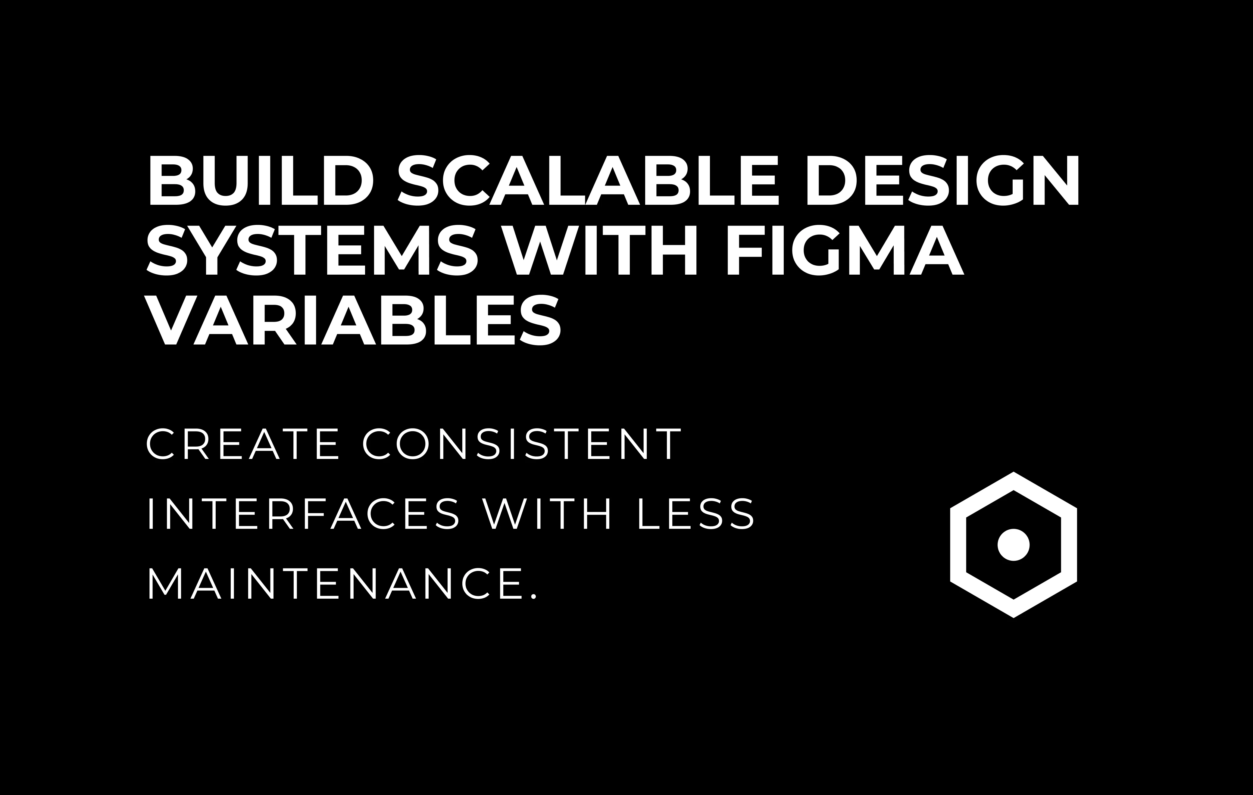
Variables
Variables and tokens are among the most important foundations for high-quality code
output. Without them, AI systems often fall back to hard values, such as fixed pixel
sizes and hex codes. MCP can read variables directly and therefore generate consistent,
design-system-compliant code. Therefore:
- Define colors exclusively through variables
- Use spacing tokens for padding, gap, border radius, and layout
- Control typography through text styles or variables
- Use semantic tokens

Figure 4: Figma variables and token structure as the foundation for consistent UI values.
Annotations
The AI or LLM does not automatically understand the functional meaning of an interface.
Additional annotations help interpret interactions, behavior, and technical
requirements more accurately. The following should be considered:
- Hover and active states (if not handled through components)
- Accessibility notes
- Keyboard interactions (if not already handled through the prototype)
- Responsive design rules
- Notes on animations
- Developer notes

Figure 5: Annotations give the AI additional context for content, development, accessibility, and interaction.
Rules
Large language models work most reliably when clear rules and fixed conventions are
defined. That is exactly why it makes sense to store project-specific rules
or guidelines. These rules describe the implicit knowledge of a codebase
- in other words, things experienced developers would normally consider automatically,
as well as additional instructions and design information. This includes, for example:
- which components should be used,
- which styles the individual components contain,
- how the AI may process the prompt,
- accessibility notes,
- how files are structured,
- which values must never be hardcoded,
- or which naming conventions apply.
Example Guidelines Structure
guidelines/
|-- overview.md            <- project philosophy, source of truth hierarchy, global rules
|-- discovery.md           <- Figma MCP reading order, node inspection workflow
|-- setup.md               <- project architecture, providers, imports, build setup
|-- icon-discovery.md      <- icon lookup workflow, code connect icon mapping

foundations/
|-- variables.md           <- Figma Variables architecture, token collections
|-- color.md               <- semantic colors, token usage hierarchy
|-- typography.md          <- text styles, scale, weights, line heights
|-- spacing.md             <- spacing tokens, layout rhythm, gap strategy
|-- surfaces.md            <- backgrounds, containers, surface hierarchy
|-- elevation.md           <- shadows, layering, elevation levels
|-- radius.md              <- border radius scale, component mapping
|-- icons.md               <- icon sizing, icon usage rules
|-- modes.md               <- light mode, dark mode, theme variants
|-- focus.md               <- focus indicators, keyboard focus rules
|-- input-styling.md       <- inputs, validation states, field appearance

components/
|-- overview.md            <- component catalog, lookup strategy
|-- button.md              <- button variants, states, accessibility
|-- input.md               <- text fields, labels, validation
|-- modal.md               <- dialogs, overlays, focus management
|-- menu.md                <- dropdowns, context menus, keyboard support
|-- tabs.md                <- tab navigation, layouts, interactions
|-- navigation.md          <- nav bars, sidebars, breadcrumbs
|-- media.md               <- avatars, images, video components
|-- icons.md               <- icon components, wrappers, patterns

composition/
|-- overview.md            <- composition principles, layout decisions
|-- alignment.md           <- alignment rules, baselines, grids
|-- icons.md               <- icon placement within layouts
|-- surfaces.md            <- card stacking, nested containers
|-- layouts.md             <- grids, sections, responsive layouts
|-- density.md             <- whitespace, content density strategy
|-- hierarchy.md           <- visual weight, information hierarchy

accessibility/
|-- overview.md            <- WCAG AA philosophy and requirements
|-- keyboard.md            <- keyboard navigation and focus order
|-- forms.md               <- labels, errors, validation, autocomplete
|-- dialogs.md             <- modal accessibility and focus trapping
|-- navigation.md          <- landmarks, skip links, semantics
|-- contrast.md            <- color contrast and readability rules
|-- screenreaders.md       <- ARIA, announcements, semantic HTML
|-- wcag-aa.md             <- complete WCAG 2.2 AA reference
|-- react-checklist.md     <- mandatory accessibility review checklist

ai/
|-- roctoc.md              <- role, objective, context, task, output contract
|-- figma-mcp.md           <- MCP workflow and node inspection strategy
|-- code-connect.md        <- component discovery and reuse rules
|-- design-to-code.md      <- implementation workflow
|-- validation.md          <- code review and validation checks
|-- prompting.md           <- prompt templates, patterns, anti-patterns
How to Write Prompts Well
The MCP server provides the AI with all relevant information from Figma. How this
information is processed and what quality the generated code reaches depends largely on
the prompt.
A good prompt not only defines the task, but also provides the necessary technical
context. This allows the AI, for example, to use existing components, take the correct
project structure into account, use specific frameworks, or follow predefined
development standards.
The rule is: the more concrete the instruction, the more precise the result. Good prompts
therefore work less like commands and more like a briefing for an experienced
development team.

Figure 6: Context makes the prompt more precise.
The ROCTOC framework provides a helpful structure:
- Role - what role should the AI take on?
- Objective - what goal should be achieved?
- Context - which information about the codebase or architecture is
relevant?
- Tasks - which concrete steps should be executed?
- Outputs - in which format should the result be delivered?
- Constraints - which rules and restrictions must be followed?
Prompt Example with the ROCTOC Framework
# ROLE

You are a Senior Frontend Engineer with a focus on Figma MCP, React, TypeScript, and design system implementation.

# OBJECTIVE

Implement the selected Login Card from Figma as production-ready React code.

The implementation must match the design pixel-perfectly and fully comply with the guidelines in the repository.

# CONTEXT

The project uses:

- React
- TypeScript
- Figma MCP
- Figma Code Connect
- Figma Variables

Important rules:

- No assumptions about shadcn/ui
- No assumptions about Iconoir
- No hardcoded colors
- No hardcoded spacing values
- No hardcoded border radius values
- No invented components when Code Connect exists

Source of truth order:

1. Code Connect component
2. Figma component
3. Figma variables
4. Custom implementation

# TASK

Analyze the selected Login Card in Figma.

Perform the following steps in exactly this order:

1. Identify all Figma components used
2. Check the available Code Connect references for each component
3. Identify all Figma variables used
4. Identify text styles
5. Identify the layout structure and Auto Layout properties

# OUTPUT REQUIREMENTS

## Design Analysis

Provide:

- used components
- used variants
- used variables
- used text styles

## Mapping

Show a mapping:

### Components

Figma Component -> React Component

### Tokens

Figma Variable -> used token

## Implementation

Generate:

- complete React component code
- TypeScript
- Imports
- Props Interface
- Accessibility
- responsive behavior

## Validation

Finally verify:

- no hardcoded colors
- no hardcoded spacing values
- no hardcoded radius values
- no duplicated components
- all possible Code Connect components used

# CONSTRAINTS

## Forbidden

- guessing Tailwind values
- guessing colors
- guessing radius values
- guessing spacing values
- rebuilding components when Code Connect exists

If information is missing in the Figma design:


1. Name the missing information
2. Make no assumptions
3. Suggest an alternative

# COMPLETION CRITERIA

The solution is only considered complete when:

- all components come from Code Connect or are newly created with justification
- all tokens come from Figma variables
- the structure matches the Figma layout
- no design decisions were invented
The special advantage in the MCP environment: large parts of this structure do not need
to be reformulated for every request. Roles, architectural guidelines, coding standards,
or design-system rules can be stored permanently in Markdown files as rules or
guidelines.

Figure 7: Storing the prompt template as a Markdown file.
This often reduces the actual prompt to just the task itself:
Implement the selected Login Card from Figma.
Follow all project guidelines.
Avoid common mistakes
Many problems are not caused by the AI itself, but by unclear designs, missing rules, or
context windows that are too large.
- ❌ The MCP server has not been started
- ❌ The Figma Desktop app is not open when the local server is being used
- ❌ Permissions are missing
- ❌ The connection between the IDE, MCP client, and Figma is unstable
- ❌ A frame that is too large is selected
- ❌ Layers are poorly named
- ❌ Components were not created cleanly
- ❌ Variables and tokens are missing
- ❌ The AI generates raw code instead of design-system code
- ❌ Project rules are missing
- ❌ The prompt is too generic
- ❌ An attempt is made to implement a complete complex page in one step
Figma recommends avoiding large or complex frames and selecting smaller areas instead,
such as individual components or logical sections. Large selections can slow tools
down, cause errors, or lead to incomplete answers.
In practice, this means working iteratively. First the header, then the card, then the
pricing section, then responsive behavior. Small, clearly defined tasks usually produce
better results than one large one-shot prompt.
Why design systems become more important through MCP
MCP does not make design systems obsolete. On the contrary, it increases their value.
A well-maintained design system provides the AI with exactly the structure it needs for
good code. Components, tokens, variants, naming conventions, and documentation become
machine-readable context.
If you want better AI-generated frontends in the future, you should first structure the
design and codebase. MCP is not a replacement for systematics. MCP amplifies
systematics.
Checklist
This is how you prepare Figma files optimally for MCP:
- ☑️ Are all reusable elements created as components?
- ☑️ Are there variants for relevant states?
- ☑️ Is Auto Layout used consistently?
- ☑️ Are layers and components named semantically?
- ☑️ Are colors, spacing, typography, and radius controlled via variables or tokens?
- ☑️ Are there annotations for behavior, responsiveness, and accessibility?
- ☑️ Are assets and icons properly integrated?
- ☑️ Are there project rules for the AI?
- ☑️ Is it clear which code components should be reused?
- ☑️ Is the selected frame small enough?
- ☑️ Is the prompt concrete and technically unambiguous?
- ☑️ Is the work iterative instead of trying to generate everything in one step?
Conclusion: LLMs love structure, rules, and consistency
MCP fundamentally changes the Figma design-to-code process. Instead of only interpreting
designs visually, AI systems can use structured design information and combine it with
project rules, code conventions, and design-system components.
However, the decisive success factor is not the tool alone. What matters is the quality
of the context.
A clean Figma file, a well-maintained design system, clear variables, precise annotations,
and well-written prompts lead to significantly better results. Teams that establish these
foundations benefit from faster handoff, more consistent code, and fewer alignment
loops between design and development.
The most important rule is:
The more structured the design, the better the code.

