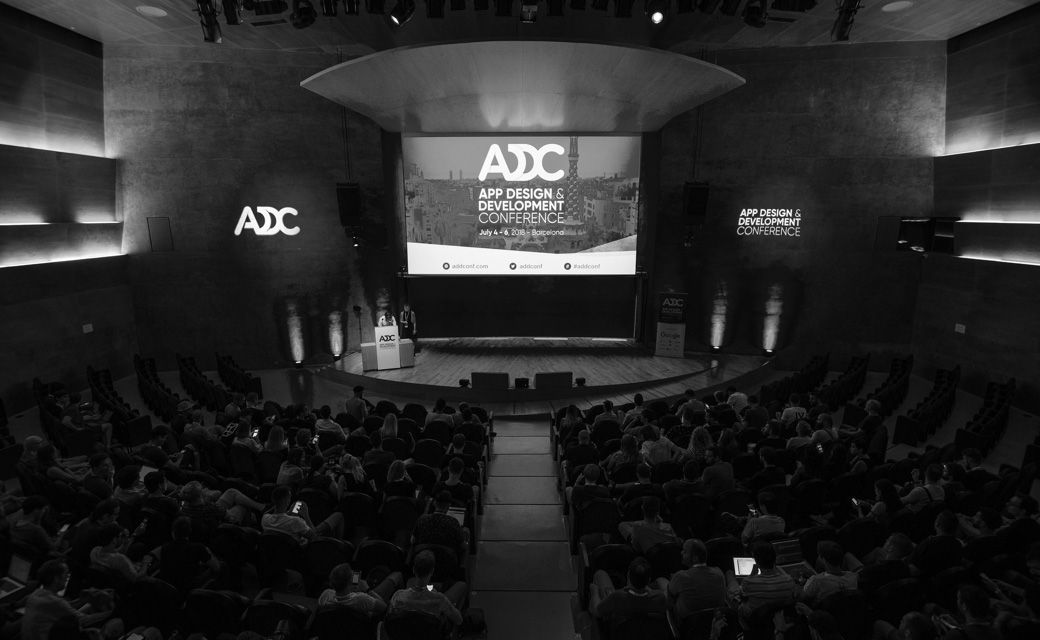
01. April 2026
Figma: Magic Button
Magic Hover Button in Figma: a UI/UX micro-interaction with real brand impact
Top!
Hello
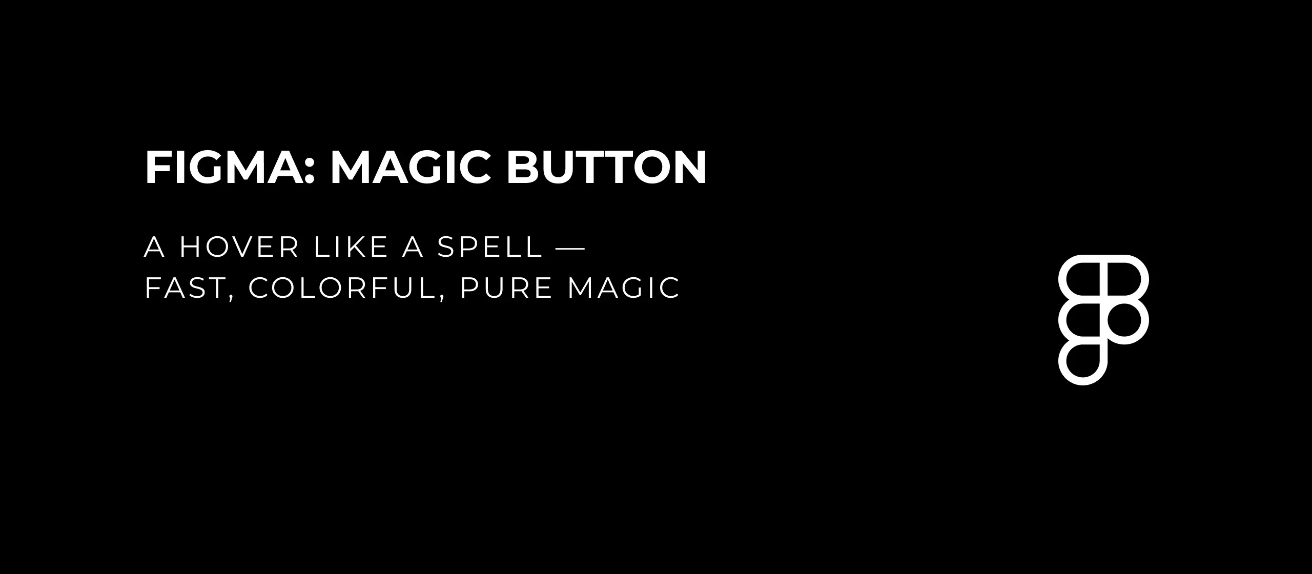
Magic Hover Button in Figma: a UI/UX micro-interaction with real brand impact
This Magic Button blends visual clarity with emotional design, creating a modern UI/UX micro-interaction that attracts attention and supports stronger click behavior. In this Figma tutorial, you will build a dynamic hover glow effect step by step, ideal for landing pages, hero sections, and high-converting call-to-action buttons.
Video: Figma Magic Hover Button for modern UI/UX interfaces
Start with a clear CTA label like “Be magic” and set the font size to around 20 pt. Convert the text into a frame and define a fixed size of 220 x 60 px. Center the content, choose a high-contrast text color, and add rounded corners plus a subtle glassmorphism look. This gives your interactive button a premium visual base.

Figure 1: CTA button base with rounded corners and glass effect
To build the glow, create a small 20 x 20 px frame and remove its fill completely. Inside it, place a larger ellipse of around 60 x 60 px. Since the ellipse exceeds the container, disable “Clip content” so the light can spill outside the frame. This is what creates the signature depth of the effect.

Figure 2: Glow setup and fill removal
Apply a Layer Blur of about 40 and ensure Fill Opacity stays at 100%. A slightly darker color helps you control the glow before you dial in final brand colors.

Figure 3: Defining blur for the glow effect
Turn this setup into a reusable Figma component. This keeps your design system consistent and scalable.

Figure 4: Reusable component for your UI system
In Properties, create at least two variants: Default and Hover. This gives you clear interaction states for a better user journey.

Figure 5: Variants for default and hover states
In the default state, set the circle opacity to 0% so the glow is hidden. In the hover state, keep the glow visible. Connect both states in the Prototype tab to simulate a smooth transition that feels close to a real product interface.

Figure 6: Connecting UI states and testing hover behavior
To increase visual energy, duplicate the component several times inside the button frame. This creates a more organic and dynamic glow movement.

Figure 7: Multiple glow components for dynamic movement
Then create a mask with all elements, including the rectangle, so the effect stays cleanly contained inside the button surface.
Add another rectangle above it with a multi-color angular gradient. This layer gives the button its high-end, brand-forward visual character.

Figure 8: Branded gradient for the final magic look
Finally, group and name your layers clearly. That speeds up iterations, team handoff, and developer collaboration.
The real value is not only the visual style, but the structure behind it: a performant, consistent hover button that improves UX, strengthens branding, and upgrades your conversion-focused UI areas.

