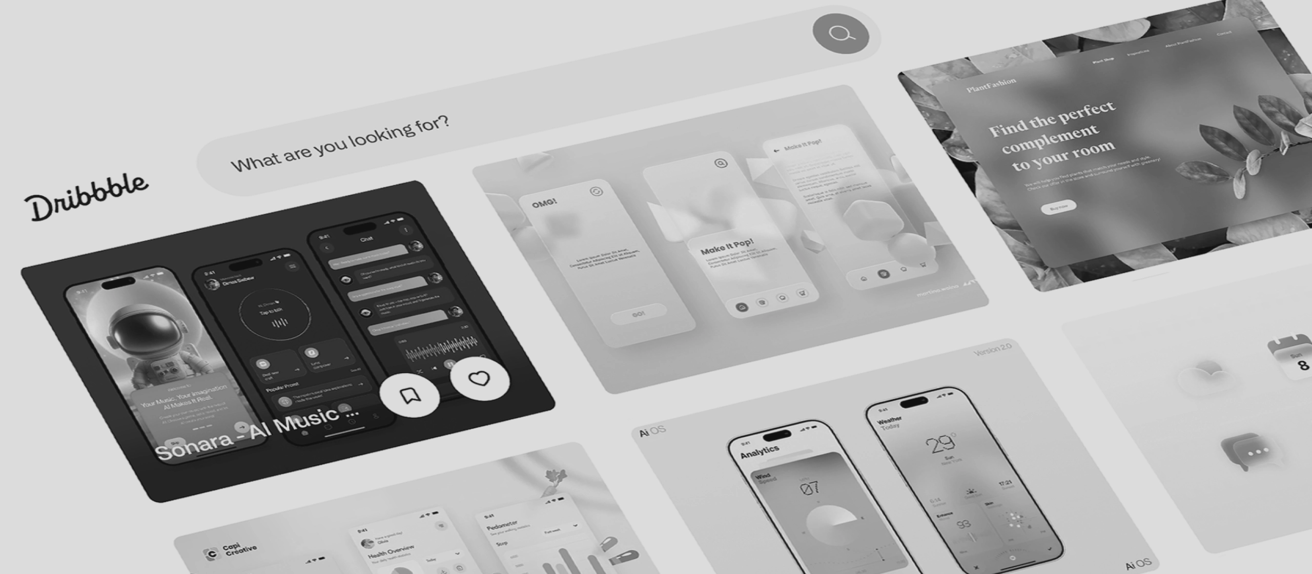
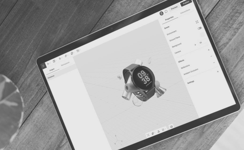
The Dribbble Hype in Overview
Platforms like Dribbble and Behance are valuable sources of inspiration and significantly
drive the further development of interfaces. They enable UI and UX designers to quickly
discover new ideas, identify trends, and develop creative concepts. Especially in the
early stages of a project, such "showcase" designs are helpful for defining visual
directions.
At the same time, they create a distorted picture of good design. Many of the interfaces
presented are not intended for real usage scenarios: they ignore technical constraints,
accessibility, performance, or complex user flows. The result is often a kind of
"fake UX" — visually impressive, but functionally questionable. This development not
infrequently leads to unrealistic client expectations and an overvaluation of aesthetics
over actual usability.

Figure 1: The Dribbble homepage – hype or real value?
Emotional Design
Emotional design aims to make products not just functional, but — as the name already
suggests — experiential. Through targeted microinteractions, humorous copy, or playful
elements, users can build a stronger connection with a product. This not only increases
brand recognition but can also boost motivation, engagement, and ultimately user
loyalty.
However, this approach also carries risks. Too much emotionality can quickly distract
from the actual goal: completing tasks efficiently. Especially in a B2B context or with
sensitive topics, an overly playful tone can feel inappropriate or even unprofessional.
There is also the risk that emotional elements are deliberately used to manipulate
behaviour. Emotional design is therefore only effective when it supports the function —
not when it replaces it.

Figure 2: The "Celebration Creatures" of the work management
platform Asana
Handmade Illustrations and Moving Text
Individual illustrations and animated content give digital products personality. They can
make complex content more accessible, support storytelling, and create a strong brand
identity. Animated text or subtle motion in particular helps direct attention and makes
interfaces feel more alive.
But here too, the line is thin. Standardised illustrations quickly lead to interchangeable
designs that lose their recognisability. Too many animations or moving elements can also
increase cognitive load, impair performance, and cause accessibility issues. When
illustration and motion offer no functional value, they quickly become decorative
gimmicks.

Figure 3: Large graphics and bold headlines – the website of ice
cream manufacturer LA BOCA
Cursor Interactions
Cursor-based interactions offer great potential for making interfaces more interactive and
intuitive. A changing cursor can, for example, provide direct feedback or give users
hints about possible actions. When used correctly, such microinteractions improve
orientation and can even increase dwell time.
It becomes problematic when these interactions turn into mere gimmicks. Many effects also
work exclusively on desktop devices and cannot be transferred to touchscreens. Hidden
content that is only visible on hover reduces discoverability and therefore usability.
Here too, the pattern holds: what is visually exciting can be functionally
obstructive.

Figure 4: The portfolio website of Petra Garmon
Y2K – Back to the 2000s
The Y2K trend brings bold colours, retro-futuristic aesthetics, and deliberately "dated"
design elements back to the web. This nostalgic approach appeals to both Millennials and
Gen Z, offering a welcome contrast to the minimalist uniformity of recent years. When
used correctly, this style can have a strong emotional impact and help differentiate
brands.
At the same time, there is a risk that such designs quickly appear cluttered, hard to
read, or simply unprofessional — especially in a business context. Many of these
stylistic devices are in direct conflict with modern UX principles such as clarity,
accessibility, and efficiency. As a temporary campaign style, Y2K design can work;
as a long-term design strategy, it is often problematic.

Figure 5: Textures, shine and gradients – just like Pit Viper's
sunglasses themselves
Sustainability and Eco Design
Web sustainability is gaining increasing importance. Digital products consume energy and
resources. Through more efficient design, reduced data loads, and deliberately crafted
user journeys, websites can contribute to environmental protection. At the same time,
users benefit from faster load times and cleaner interfaces.
However, sustainability frequently conflicts with visual trends and business goals.
Complex animations, large images, or data-intensive features often contradict the
ambition of resource-conscious design. The impact is also difficult to measure for many
stakeholders, which makes prioritisation harder. Last but not least, there is a risk of
greenwashing when sustainability is only communicated superficially.

Figure 6: "Planting trees" with every search thanks to Ecosia
Conclusion
The UI/UX trends of 2026 make one thing clear: not everything that impresses visually
also creates real value. Many trends emerge from a design-centred perspective, while the
actual needs of users fade into the background. Good design in 2026 therefore means
above all one thing: making conscious decisions. Which elements truly support users?
Which are merely visual effects with no functional benefit? In the end: the best trend
is one that users don't perceive as a trend at all — but simply as a naturally good
experience.